Getting the right color for a special project often poses a real challenge. The sheer number of colors available now is tremendous, yet the right color may still be elusive. Part of the difficulty involves some popular misconceptions.

A Few Common Fallacies
-
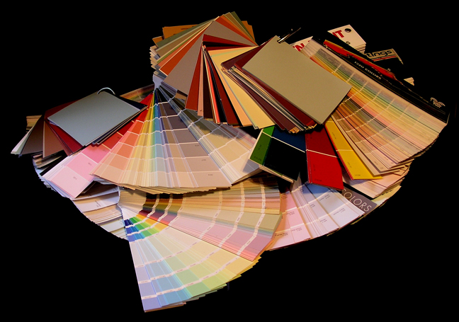
With so many brands of paint and designer color lines the perfect color for your project must surely be among them.
-
The “Universal Colorants” used to tint paints can make any color.
-
The computerized color matching systems (using a spectrophotometer) will automatically match your color sample.
-
Your painter can help with color.
The Facts
-
Although a great many color choices are available today (including designer and other specialty lines), fixed and definite limitations remain.
-
These limitations exist within the universal colorant systems themselves. There is no single universal colorant system. There are multiple suppliers and there are variations in the actual colorant hues from one company to the next. The blue in one system may be greener than the blue in another.
-
The computerized spectrophotometer is a useful tool but it does not substitute for the human eye. An important color matching project really depends on an intelligent application of color principles through trial and error. The acuity and astuteness of the color matcher is indispensable.
-
Customers often turn to their painter for color advice. Good painters are professional paint applicators. They can give sound advice on what product to use for a particular application. This does not automatically guarantee that they have an eye for color or even understand it.
Case History
“While waiting at a paint store one day for a custom color sample, I started a conversation with a lady who walked in quite distressed. She had just had an expensive set of furniture delivered to her home, but the color of the upholstery fabric didn’t look nearly as good as it had in the showroom. She was at her wits’ end because nothing went together, and she wasn’t about to reupholster the furniture or tear up the carpet. She knew she had to repaint the walls but had no idea where to begin. When I told her about my work creating the colors at the Davenport Hotel, she was thrilled at the prospect of my coming to her aid.
Her walls were slightly off-white, the wall-to-wall carpet was a shade of blue, and the upholstery had shades of blue and green, slightly shot through with brown. Working with a principle of using complimentary colors to offset the blues and greens, I knew that some shade of reddish orange was needed. Although I had fan-decks from every paint store and a great chart of American historical colors, I still didn’t find the subtle shade I was looking for. Neither did I have any luck at the home centers which carried multiple color lines from various companies and designers. I would have to make it up myself.
I knew of an artists’ pigment that would do exactly what was needed: Winsor & Newton’s “Burnt Sienna,” available in pints for a reasonable price. I took a commercial paint color that was close but needed this warm brown to perfect it. I then measured samples of the commercial paint with the added acrylic color until I arrived at a formula that could tie the whole living area together.
The proof test would have to stand up to the fact that the living spaces and kitchen were all open and lit from multiple sources, including skylights. Light and shaded areas were all different at any time of the day or night. So I tested our samples in all these various lighting situations until we were satisfied. It worked! The upholstery, carpet, and walls were now lovely together.”
Melville Holmes
